Today's color palette comes from a German Red Cross poster from 1914.
Are you excited? I'm excited.
It's less to do with the palette, though something about it does really appeal to me somehow.
Let me bring you on a bit of a journey.
The other day, I was watching Disney's Paul Bunyan, which if you've never watched it or haven't watched it in a while, I highly recommend it [for the backgrounds alone](
https://3ofpents.tumblr.com/post/725366629406490624/the-backgrounds-of-the-old-paul-bunyan-cartoon-are). They're a classic example of that sort of classic painted, textured minimalist mid-century style. They reminded me so much of [the travel posters from the 1930's and '40s](
https://www.loc.gov/free-to-use/travel-posters/) and as I was thinking about those, I just really wanted to try out the style.
So I did!
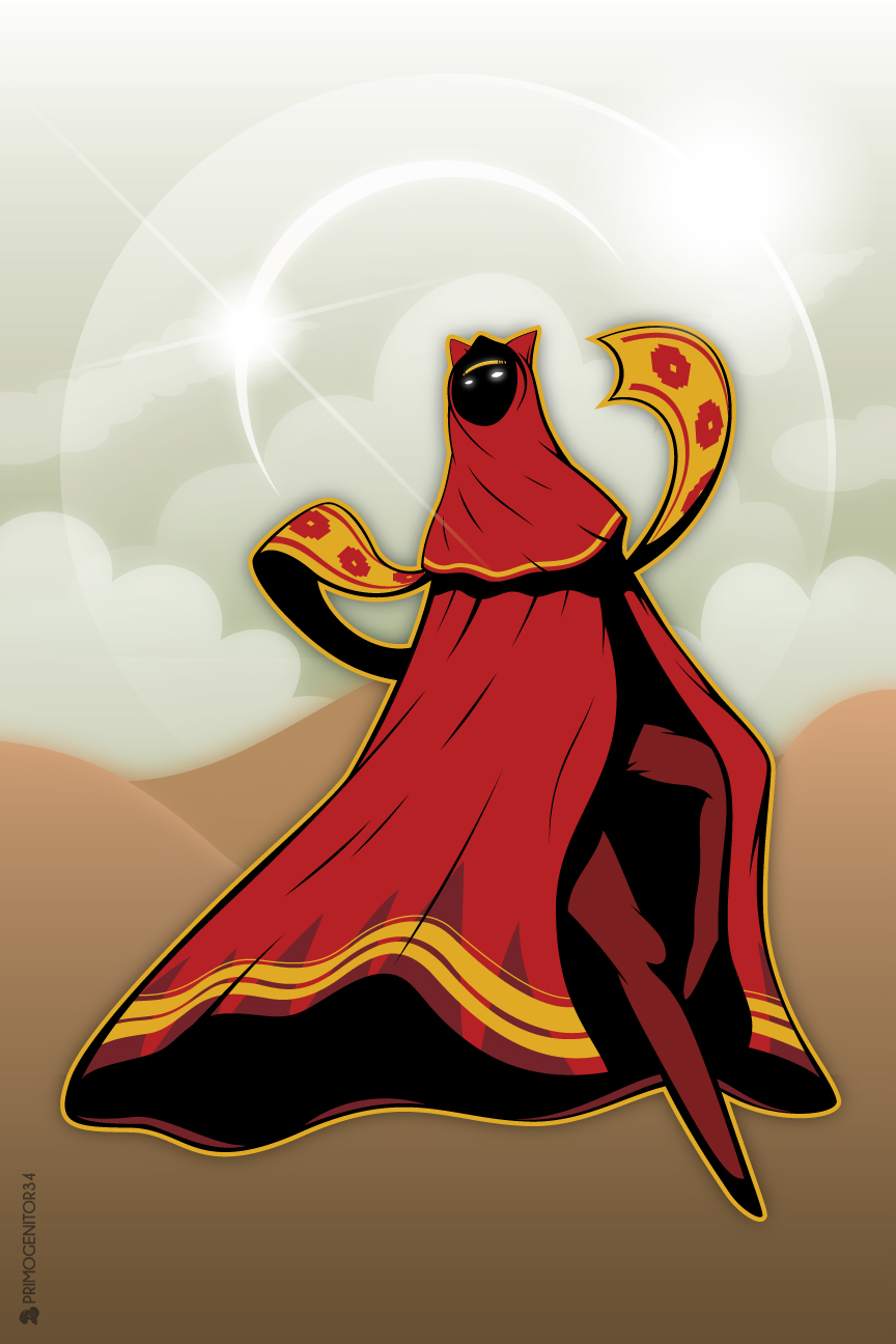
It didn't even take me that long to decide on a subject. I grew up in New Jersey and lived there for most of my life, and the thing that really pains me about cryptid fandom in the lack of love for the Jersey Devil.
For those who've never heard of the Jersey Devil, [I explained some of the lore on my Tumblr](
https://www.tumblr.com/3ofpents/725503584202113024/100-palettes-challenge-palette-15-greetings).
They say that anyone who's spent a night in the pine barrens has a story about encountering the Jersey Devil.
So when I thought about what location I wanted to make a travel poster for, obviously my first and only answer was the NJ pine barrens, and I needed to include the Jersey Devil on the poster somewhere.
And damn I had so much fun with this! Which you can probably tell, I think this is the most detailed piece I've ever made, and I'm so proud of it. I originally planned to have the Jersey Devil be lurking amongst the trees in a more prominent position, but with the limited palette I wasn't sure I'd be able to make it look right. And I really liked the idea of it kind of photo bombing the poster.
There was a little bit of frustration trying to figure out how I wanted to do the pine needles and the texture on the ground. But it was so satisfying when I finally hit on the look I wanted that the frustration barely even registered after that. And the tree textures, damn, I was expecting to be way more frustrated by that, but it worked out so well.
I loved the gradient around the moon so much that I added another one to the ground. I meant to play around with some gradients on the text but I forgot. I probably could've added some gradients to the trees too. When I do this again (because I'm definitely doing this again), I'm absolutely going to spend more time with gradients.
But god I'm so happy with how this came out, I might just print it out for myself to hang up.
Today's color palette comes from a German Red Cross poster from 1914.
Are you excited? I'm excited.
It's less to do with the palette, though something about it does really appeal to me somehow.
Let me bring you on a bit of a journey.
The other day, I was watching Disney's Paul Bunyan, which if you've never watched it or haven't watched it in a while, I highly recommend it [for the backgrounds alone](https://3ofpents.tumblr.com/post/725366629406490624/the-backgrounds-of-the-old-paul-bunyan-cartoon-are). They're a classic example of that sort of classic painted, textured minimalist mid-century style. They reminded me so much of [the travel posters from the 1930's and '40s](https://www.loc.gov/free-to-use/travel-posters/) and as I was thinking about those, I just really wanted to try out the style.
So I did!
It didn't even take me that long to decide on a subject. I grew up in New Jersey and lived there for most of my life, and the thing that really pains me about cryptid fandom in the lack of love for the Jersey Devil.
For those who've never heard of the Jersey Devil, [I explained some of the lore on my Tumblr](https://www.tumblr.com/3ofpents/725503584202113024/100-palettes-challenge-palette-15-greetings).
They say that anyone who's spent a night in the pine barrens has a story about encountering the Jersey Devil.
So when I thought about what location I wanted to make a travel poster for, obviously my first and only answer was the NJ pine barrens, and I needed to include the Jersey Devil on the poster somewhere.
And damn I had so much fun with this! Which you can probably tell, I think this is the most detailed piece I've ever made, and I'm so proud of it. I originally planned to have the Jersey Devil be lurking amongst the trees in a more prominent position, but with the limited palette I wasn't sure I'd be able to make it look right. And I really liked the idea of it kind of photo bombing the poster.
There was a little bit of frustration trying to figure out how I wanted to do the pine needles and the texture on the ground. But it was so satisfying when I finally hit on the look I wanted that the frustration barely even registered after that. And the tree textures, damn, I was expecting to be way more frustrated by that, but it worked out so well.
I loved the gradient around the moon so much that I added another one to the ground. I meant to play around with some gradients on the text but I forgot. I probably could've added some gradients to the trees too. When I do this again (because I'm definitely doing this again), I'm absolutely going to spend more time with gradients.
But god I'm so happy with how this came out, I might just print it out for myself to hang up.