

-
41 Posts
-
53 Photos
-
2 Videos
-
Followed by 0 people
Search
Recent Updates
-
The view of our backyard from our second floor hall window.
You can see a huge stump from a long-since cut down tree in a garden bed full of the Fall remains of plants that were planted long ago and plants we planted this year. The garden bed is lined by a stone wall that may have been here since the house was built in the 1800's. On the top you can see a window that was installed during a modern renovation of the house. On the bottom right you can see the roof of the barn that was a stable when the house was first built. And on the roof of the barn you can see a toy car from the small child who lived here before us.The view of our backyard from our second floor hall window. You can see a huge stump from a long-since cut down tree in a garden bed full of the Fall remains of plants that were planted long ago and plants we planted this year. The garden bed is lined by a stone wall that may have been here since the house was built in the 1800's. On the top you can see a window that was installed during a modern renovation of the house. On the bottom right you can see the roof of the barn that was a stable when the house was first built. And on the roof of the barn you can see a toy car from the small child who lived here before us.0 Comments 0 Shares 182 Views -
A second prompt from 9/9. It was something like "a large spellbook stands on a pedestal, its pages fluttering in an unseen breeze, as magic incantations whisper around it".A second prompt from 9/9. It was something like "a large spellbook stands on a pedestal, its pages fluttering in an unseen breeze, as magic incantations whisper around it".0 Comments 0 Shares 123 Views
-
Today's palette comes from a fashion illustration in _The Delineator_ magazine from 1906.
Like I mentioned in the previous piece, this is one of the palettes I was really looking forward to — I love a pastel rainbow. It's also the one I was thinking of specifically when I made the decision to go through them in order because I knew I'd use up all the palettes I really liked first and end up with a bunch that I really don't. Of course this one is early on in the book anyway! But honestly one of my least favorite palettes was also an early one.
I got the inspiration for this after watching an art asmr channel use inksticks to paint some watercolor flowers (sometimes the asmr videos are the only things that help our toddler get down for a nap, though usually they're more into the restoration videos). Not that I even tried to attempt doing anything watercolor-ish, but we have this beautiful peony plant by our porch (we actually have two, but one of them hasn't flowered for the past two years, sadly) and these colors are really just perfect for it.
I didn't get as much depth as I wanted to, but honestly I got overwhelmed VERY quickly. Like peonies in general have very densely packed, curly petals, it's one of the reasons they're such a popular flower. But this variety really does just look like a curly koosh ball set on top of a plate of petals.Today's palette comes from a fashion illustration in _The Delineator_ magazine from 1906. Like I mentioned in the previous piece, this is one of the palettes I was really looking forward to — I love a pastel rainbow. It's also the one I was thinking of specifically when I made the decision to go through them in order because I knew I'd use up all the palettes I really liked first and end up with a bunch that I really don't. Of course this one is early on in the book anyway! But honestly one of my least favorite palettes was also an early one. I got the inspiration for this after watching an art asmr channel use inksticks to paint some watercolor flowers (sometimes the asmr videos are the only things that help our toddler get down for a nap, though usually they're more into the restoration videos). Not that I even tried to attempt doing anything watercolor-ish, but we have this beautiful peony plant by our porch (we actually have two, but one of them hasn't flowered for the past two years, sadly) and these colors are really just perfect for it. I didn't get as much depth as I wanted to, but honestly I got overwhelmed VERY quickly. Like peonies in general have very densely packed, curly petals, it's one of the reasons they're such a popular flower. But this variety really does just look like a curly koosh ball set on top of a plate of petals.0 Comments 0 Shares 128 Views -
We've made it through the first decade!
Today's palette is from a Russian (I believe) ballet costume design from 1910.
I really did want to use this palette to work on some interesting color work! I really did! But I had to play around with it a little by setting each one as a background and seeing how the tones shifted on the rest of them, and as soon as I noticed that that dark yellow-orange read more as a flesh tone against the lighter orange? All I saw was Wally West as Kid Flash.
So fanart!
It's not as adventurous color-wise as I wanted it to be, but I'm proud of myself for considering the way the colors look layered on top of each other. I'm proud of myself for finding a reference photo of a sprinter that forced me to draw hands. And I also got to play around with some other brushes trying to find the right look for the speed blur.
Also, like, the Flashes especially have a look that really lends itself well to this minimalist style, which was a boon given the really limited palette. It also forced me to really take into consideration the shapes of the runner's muscles in the reference photo, and then how to alter them to make them look "right" without any outlines or shading. That right-most arm really gave me some trouble, I ended up having to redraw it a few times, but I'm really happy with how it all came out.We've made it through the first decade! Today's palette is from a Russian (I believe) ballet costume design from 1910. I really did want to use this palette to work on some interesting color work! I really did! But I had to play around with it a little by setting each one as a background and seeing how the tones shifted on the rest of them, and as soon as I noticed that that dark yellow-orange read more as a flesh tone against the lighter orange? All I saw was Wally West as Kid Flash. So fanart! It's not as adventurous color-wise as I wanted it to be, but I'm proud of myself for considering the way the colors look layered on top of each other. I'm proud of myself for finding a reference photo of a sprinter that forced me to draw hands. And I also got to play around with some other brushes trying to find the right look for the speed blur. Also, like, the Flashes especially have a look that really lends itself well to this minimalist style, which was a boon given the really limited palette. It also forced me to really take into consideration the shapes of the runner's muscles in the reference photo, and then how to alter them to make them look "right" without any outlines or shading. That right-most arm really gave me some trouble, I ended up having to redraw it a few times, but I'm really happy with how it all came out.0 Comments 0 Shares 291 Views -
Today's palette comes from a US Marines poster printed in 1917.
I was Concerned about this one. The colors are so close together I knew it was going to just turn muddy unless I was really careful about how I used them. And I'd run out of home states so I didn't have a an easy option to fall back on!
But the palette is very warm and full of earth-tones, so I figured my best bet was to focus around the mid/southwestern US with interesting landscapes and rock formations — a classic vintage travel poster subject. I hit on the jackalope as my cryptid of choice this time, since it's also these kind of mid-tone, warm earthtones and one that can totally be hopping around a daytime scene.
I knew the jackalope was a taxidermy "hoax" like the fiji mermaid. I put that in quotes because everything I've read about it suggests that the original taxidermy piece was just a fun joke and everyone was (and still is) in on it. So much so that [the Wyoming Game and Fish Department actually has an information page on the jackalope](https://wgfd.wyo.gov/Regional-Offices/Green-River-Region/Critter-Spotlight/Jackalope). But I didn't know much more than that.
The men that created the original jackalope were hunters and taxidermists from Douglas, WY ([whose town logo I love](https://cityofdouglas.org/166/Government)). And when I looked up Douglas in my hunt for a landscape feature for the jackalope to hang out in, I found nearby [Ayers Natural Bridge Park](https://www.wyohistory.org/encyclopedia/ayres-natural-bridge), named for Ayers Natural Bridge, an absolutely gorgeous arched rock formation that I absolutely did not do justice to.
But I did my best! Especially with the limited palette.
Honestly? I might just play around with some rock formations in this style outside of the palette challenge. I could have doubled the amount of colors I used here on the bridge itself alone. Nevermind the river running through it and all the vegetation around it that I just wasn't able to do using only this palette.Today's palette comes from a US Marines poster printed in 1917. I was Concerned about this one. The colors are so close together I knew it was going to just turn muddy unless I was really careful about how I used them. And I'd run out of home states so I didn't have a an easy option to fall back on! But the palette is very warm and full of earth-tones, so I figured my best bet was to focus around the mid/southwestern US with interesting landscapes and rock formations — a classic vintage travel poster subject. I hit on the jackalope as my cryptid of choice this time, since it's also these kind of mid-tone, warm earthtones and one that can totally be hopping around a daytime scene. I knew the jackalope was a taxidermy "hoax" like the fiji mermaid. I put that in quotes because everything I've read about it suggests that the original taxidermy piece was just a fun joke and everyone was (and still is) in on it. So much so that [the Wyoming Game and Fish Department actually has an information page on the jackalope](https://wgfd.wyo.gov/Regional-Offices/Green-River-Region/Critter-Spotlight/Jackalope). But I didn't know much more than that. The men that created the original jackalope were hunters and taxidermists from Douglas, WY ([whose town logo I love](https://cityofdouglas.org/166/Government)). And when I looked up Douglas in my hunt for a landscape feature for the jackalope to hang out in, I found nearby [Ayers Natural Bridge Park](https://www.wyohistory.org/encyclopedia/ayres-natural-bridge), named for Ayers Natural Bridge, an absolutely gorgeous arched rock formation that I absolutely did not do justice to. But I did my best! Especially with the limited palette. Honestly? I might just play around with some rock formations in this style outside of the palette challenge. I could have doubled the amount of colors I used here on the bridge itself alone. Nevermind the river running through it and all the vegetation around it that I just wasn't able to do using only this palette.0 Comments 0 Shares 131 Views -
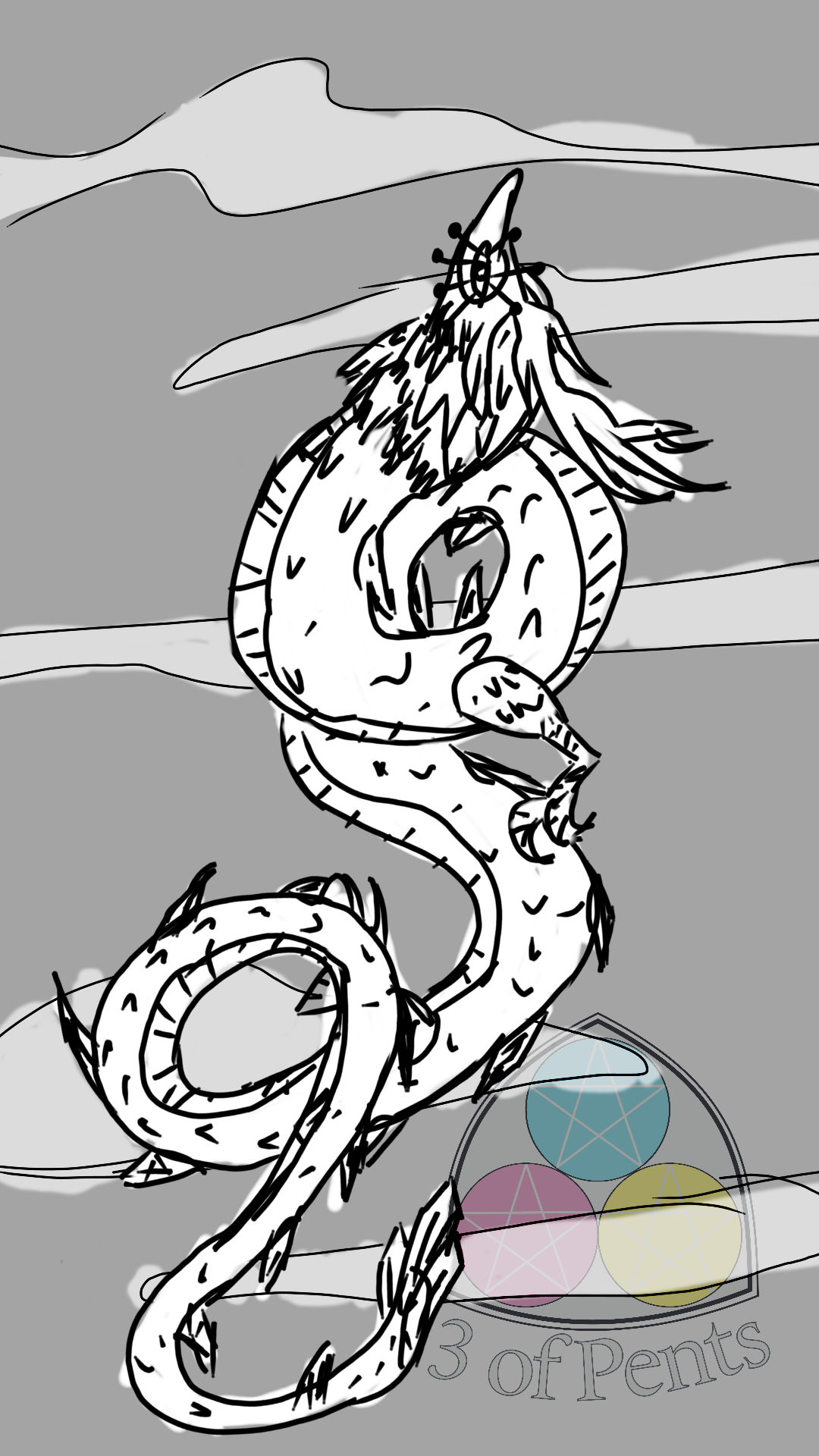
The prompt today was "your favorite dragon". We've been playing Tears of the Kingdom, so naturally the answer to that was "the light dragon" (no spoilers, I promise).The prompt today was "your favorite dragon". We've been playing Tears of the Kingdom, so naturally the answer to that was "the light dragon" (no spoilers, I promise).0 Comments 0 Shares 124 Views
-
I know I'm late again this week. I'm in the midst of a lot of school stuff. I've mentioned, I think, but I've gone back to school to get a graphic design certification. I started last Fall and it was my hope to be done by this summer because the certification programs are designed for adults with careers who want to expand their skill sets and so are pared down to only the classes that are directly relevant to the subject matter. In my case that's only 9 classes, so 3 per semester. But unfortunately I had to withdraw in the Spring because of some health issues. So now I'm trying to pick up where I left off after the school went and changed a bunch of their online systems. So now I get to try and recover my old accounts on their new system and deal with class requirements that don't exist for my program, but apparently exist now for individual classes that are required.
And on top of that we're prepping our toddler to go to daycare, which comes with A LOT of paperwork and supplies lists and doctor signatures and also EMOTIONS.
Anyway.
Today's palette comes from a poster that appears to have been an activist piece of art. I've tried not to go into too much detail here about the posters since the bulk of this book is the palettes and the pieces they were picked from. I'm already posting every single palette in the book, so I'd rather not include the posters also. But I just love this one so much, I have to at least share the information so you can look it up yourselves. It's called "Dig" by Sadie Wendell Mitchell, it's part of a series she did called "Girls Will Be Girls". It depicts a young woman perched on a chair engrossed in a book, and also surrounded by stacks of books. Only a few of the books have visible titles, "The Study of Bugology", "The Psychology of the Male Human", and "Economy" (the one she's reading). And on the wall you can see part of a poster that says "DO IT NOW".
It feels like a very pointed protestation as a poster designed in 1909.
I struggled with this palette a lot. It's not only very similar to a lot of the previous palettes, the values are just so similar, particular with the green and teal. It works fine in the original poster because Mitchell used a heavy black outline, but the author of the book chose not to include that in the palette.
I actually started a completely different piece that going to be a face study, but I just didn't like the way the colors were playing together. So I ended up scrapping it.
So I pulled back a bit. Our dahlias have started blooming and the first ones to pop were these gorgeous red and yellow blooms, and I've wanted to draw a fairy for one of these for several palettes so far, so I did it.
The dahlias were SO much easier and more fun to draw than the peony was. They're so geometric, I really just enjoyed layering the petals and the colors.
I attempted to give the fairy some petal clothes, but it just wasn't doing what I wanted it to do. And I think the form is distinct enough to make her out. I do really like the effect of the teal on the green; the heavy similarities of them both make the fairy and flowers pop more. I do wish I'd filled in some more greenery in the background, but honestly I'd spent so much time on this palette already I didn't have it in me.
I'm really pleased with the final result, though, and I doubt this will be the last fairy piece in this series.
I want to shout out [Fat Photo Ref](https://www.fatphotoref.com/) again. I used them for the pose and the hair for the fairy and I remain exceptionally pleased with the range of references available and the easy navigation.I know I'm late again this week. I'm in the midst of a lot of school stuff. I've mentioned, I think, but I've gone back to school to get a graphic design certification. I started last Fall and it was my hope to be done by this summer because the certification programs are designed for adults with careers who want to expand their skill sets and so are pared down to only the classes that are directly relevant to the subject matter. In my case that's only 9 classes, so 3 per semester. But unfortunately I had to withdraw in the Spring because of some health issues. So now I'm trying to pick up where I left off after the school went and changed a bunch of their online systems. So now I get to try and recover my old accounts on their new system and deal with class requirements that don't exist for my program, but apparently exist now for individual classes that are required. And on top of that we're prepping our toddler to go to daycare, which comes with A LOT of paperwork and supplies lists and doctor signatures and also EMOTIONS. Anyway. Today's palette comes from a poster that appears to have been an activist piece of art. I've tried not to go into too much detail here about the posters since the bulk of this book is the palettes and the pieces they were picked from. I'm already posting every single palette in the book, so I'd rather not include the posters also. But I just love this one so much, I have to at least share the information so you can look it up yourselves. It's called "Dig" by Sadie Wendell Mitchell, it's part of a series she did called "Girls Will Be Girls". It depicts a young woman perched on a chair engrossed in a book, and also surrounded by stacks of books. Only a few of the books have visible titles, "The Study of Bugology", "The Psychology of the Male Human", and "Economy" (the one she's reading). And on the wall you can see part of a poster that says "DO IT NOW". It feels like a very pointed protestation as a poster designed in 1909. I struggled with this palette a lot. It's not only very similar to a lot of the previous palettes, the values are just so similar, particular with the green and teal. It works fine in the original poster because Mitchell used a heavy black outline, but the author of the book chose not to include that in the palette. I actually started a completely different piece that going to be a face study, but I just didn't like the way the colors were playing together. So I ended up scrapping it. So I pulled back a bit. Our dahlias have started blooming and the first ones to pop were these gorgeous red and yellow blooms, and I've wanted to draw a fairy for one of these for several palettes so far, so I did it. The dahlias were SO much easier and more fun to draw than the peony was. They're so geometric, I really just enjoyed layering the petals and the colors. I attempted to give the fairy some petal clothes, but it just wasn't doing what I wanted it to do. And I think the form is distinct enough to make her out. I do really like the effect of the teal on the green; the heavy similarities of them both make the fairy and flowers pop more. I do wish I'd filled in some more greenery in the background, but honestly I'd spent so much time on this palette already I didn't have it in me. I'm really pleased with the final result, though, and I doubt this will be the last fairy piece in this series. I want to shout out [Fat Photo Ref](https://www.fatphotoref.com/) again. I used them for the pose and the hair for the fairy and I remain exceptionally pleased with the range of references available and the easy navigation.0 Comments 0 Shares 139 Views -
Today's palette comes from a The House Beautiful magazine cover by Maurice Day published in 1919.
I don't think this is my best work in this travel poster series. I severely overestimated my patience to draw windows onto the buildings, and underestimated how unfinished the whole piece would look without them. Maybe someday I'll go back and add the windows in.
But regardless, this is what's done now!
When I was trying to decide what to do with the last palette, I realized that there was one more home state that I hadn't done: New York. Both sides of my family are from Brooklyn, I was originally born in Brooklyn, and New York City played a huge role in my upbringing in general. I don't know that there are any actual cryptids unique to NYC, but there was one particular urban legend that went around a lot while I was growing up: Alligators in the sewers.
See, roundabouts the '80s, baby alligators were really popular pets. They were unique, about the size of an iguana, and at least seemingly pretty low-maintenance. If you ever watched Clarissa Explains It All back in the day on Nickelodeon, you probably remember her having a pet baby alligator she named Elvis and that she kept in a wading pool full of sand in her bedroom. The problem is that alligators don't stay the size of an iguana and they are predators that can be extremely dangerous.
So once the alligator got too big, the vast majority of owners got rid of them. Some of them were given to animal rescues or rehab organizations; some of them were given to reptile breeders; and some of them were gotten rid of in less savory ways.
When you hear about alligators being captured in rivers and lakes where they're not native? Those are typically alligators that used to be pets and were just released into the wild when they got too big and/or dangerous. In NYC, that very real story was turned into a bit of an absurd urban legend. The legend goes that NYC alligator pet owners, when their alligators got too big, they decided to just flush them down the toilet like a dead fish, and all of the alligators that survived the flushing ended up in the sewers under the city where they thrive on a diet of rats and the occasional unfortunate sanitation worker.
Obviously this isn't true. As many experts have pointed out over the years, even if people did try to flush an alligator down the toilet, pre-2000's plumbing wouldn't have been able to handle even a baby alligator, nevermind one that grew big enough to make their owner decide to get rid of it. There also simply haven't been any verified reports which, considering how many sanitation workers have been down in the sewers over the years, there would have to be at least one.
But it is a silly little story from back when NYC was allowed to be weird, and I think I heard at some point that it was part of the inspiration for the Teenage Mutant Ninja Turtles. Though maybe that's an urban legend too.Today's palette comes from a The House Beautiful magazine cover by Maurice Day published in 1919. I don't think this is my best work in this travel poster series. I severely overestimated my patience to draw windows onto the buildings, and underestimated how unfinished the whole piece would look without them. Maybe someday I'll go back and add the windows in. But regardless, this is what's done now! When I was trying to decide what to do with the last palette, I realized that there was one more home state that I hadn't done: New York. Both sides of my family are from Brooklyn, I was originally born in Brooklyn, and New York City played a huge role in my upbringing in general. I don't know that there are any actual cryptids unique to NYC, but there was one particular urban legend that went around a lot while I was growing up: Alligators in the sewers. See, roundabouts the '80s, baby alligators were really popular pets. They were unique, about the size of an iguana, and at least seemingly pretty low-maintenance. If you ever watched Clarissa Explains It All back in the day on Nickelodeon, you probably remember her having a pet baby alligator she named Elvis and that she kept in a wading pool full of sand in her bedroom. The problem is that alligators don't stay the size of an iguana and they are predators that can be extremely dangerous. So once the alligator got too big, the vast majority of owners got rid of them. Some of them were given to animal rescues or rehab organizations; some of them were given to reptile breeders; and some of them were gotten rid of in less savory ways. When you hear about alligators being captured in rivers and lakes where they're not native? Those are typically alligators that used to be pets and were just released into the wild when they got too big and/or dangerous. In NYC, that very real story was turned into a bit of an absurd urban legend. The legend goes that NYC alligator pet owners, when their alligators got too big, they decided to just flush them down the toilet like a dead fish, and all of the alligators that survived the flushing ended up in the sewers under the city where they thrive on a diet of rats and the occasional unfortunate sanitation worker. Obviously this isn't true. As many experts have pointed out over the years, even if people did try to flush an alligator down the toilet, pre-2000's plumbing wouldn't have been able to handle even a baby alligator, nevermind one that grew big enough to make their owner decide to get rid of it. There also simply haven't been any verified reports which, considering how many sanitation workers have been down in the sewers over the years, there would have to be at least one. But it is a silly little story from back when NYC was allowed to be weird, and I think I heard at some point that it was part of the inspiration for the Teenage Mutant Ninja Turtles. Though maybe that's an urban legend too.0 Comments 0 Shares 275 Views -
Today's color palette comes from a German Red Cross poster from 1914.
Are you excited? I'm excited.
It's less to do with the palette, though something about it does really appeal to me somehow.
Let me bring you on a bit of a journey.
The other day, I was watching Disney's Paul Bunyan, which if you've never watched it or haven't watched it in a while, I highly recommend it [for the backgrounds alone](https://3ofpents.tumblr.com/post/725366629406490624/the-backgrounds-of-the-old-paul-bunyan-cartoon-are). They're a classic example of that sort of classic painted, textured minimalist mid-century style. They reminded me so much of [the travel posters from the 1930's and '40s](https://www.loc.gov/free-to-use/travel-posters/) and as I was thinking about those, I just really wanted to try out the style.
So I did!
It didn't even take me that long to decide on a subject. I grew up in New Jersey and lived there for most of my life, and the thing that really pains me about cryptid fandom in the lack of love for the Jersey Devil.
For those who've never heard of the Jersey Devil, [I explained some of the lore on my Tumblr](https://www.tumblr.com/3ofpents/725503584202113024/100-palettes-challenge-palette-15-greetings).
They say that anyone who's spent a night in the pine barrens has a story about encountering the Jersey Devil.
So when I thought about what location I wanted to make a travel poster for, obviously my first and only answer was the NJ pine barrens, and I needed to include the Jersey Devil on the poster somewhere.
And damn I had so much fun with this! Which you can probably tell, I think this is the most detailed piece I've ever made, and I'm so proud of it. I originally planned to have the Jersey Devil be lurking amongst the trees in a more prominent position, but with the limited palette I wasn't sure I'd be able to make it look right. And I really liked the idea of it kind of photo bombing the poster.
There was a little bit of frustration trying to figure out how I wanted to do the pine needles and the texture on the ground. But it was so satisfying when I finally hit on the look I wanted that the frustration barely even registered after that. And the tree textures, damn, I was expecting to be way more frustrated by that, but it worked out so well.
I loved the gradient around the moon so much that I added another one to the ground. I meant to play around with some gradients on the text but I forgot. I probably could've added some gradients to the trees too. When I do this again (because I'm definitely doing this again), I'm absolutely going to spend more time with gradients.
But god I'm so happy with how this came out, I might just print it out for myself to hang up.Today's color palette comes from a German Red Cross poster from 1914. Are you excited? I'm excited. It's less to do with the palette, though something about it does really appeal to me somehow. Let me bring you on a bit of a journey. The other day, I was watching Disney's Paul Bunyan, which if you've never watched it or haven't watched it in a while, I highly recommend it [for the backgrounds alone](https://3ofpents.tumblr.com/post/725366629406490624/the-backgrounds-of-the-old-paul-bunyan-cartoon-are). They're a classic example of that sort of classic painted, textured minimalist mid-century style. They reminded me so much of [the travel posters from the 1930's and '40s](https://www.loc.gov/free-to-use/travel-posters/) and as I was thinking about those, I just really wanted to try out the style. So I did! It didn't even take me that long to decide on a subject. I grew up in New Jersey and lived there for most of my life, and the thing that really pains me about cryptid fandom in the lack of love for the Jersey Devil. For those who've never heard of the Jersey Devil, [I explained some of the lore on my Tumblr](https://www.tumblr.com/3ofpents/725503584202113024/100-palettes-challenge-palette-15-greetings). They say that anyone who's spent a night in the pine barrens has a story about encountering the Jersey Devil. So when I thought about what location I wanted to make a travel poster for, obviously my first and only answer was the NJ pine barrens, and I needed to include the Jersey Devil on the poster somewhere. And damn I had so much fun with this! Which you can probably tell, I think this is the most detailed piece I've ever made, and I'm so proud of it. I originally planned to have the Jersey Devil be lurking amongst the trees in a more prominent position, but with the limited palette I wasn't sure I'd be able to make it look right. And I really liked the idea of it kind of photo bombing the poster. There was a little bit of frustration trying to figure out how I wanted to do the pine needles and the texture on the ground. But it was so satisfying when I finally hit on the look I wanted that the frustration barely even registered after that. And the tree textures, damn, I was expecting to be way more frustrated by that, but it worked out so well. I loved the gradient around the moon so much that I added another one to the ground. I meant to play around with some gradients on the text but I forgot. I probably could've added some gradients to the trees too. When I do this again (because I'm definitely doing this again), I'm absolutely going to spend more time with gradients. But god I'm so happy with how this came out, I might just print it out for myself to hang up.0 Comments 0 Shares 287 Views -
Another bird! What can I say, I love birds.
This palette comes from a German (I'm pretty sure) postcard from 1907.
So last spring, I went back to school to get some graphic design credentials. In one of my classes we were assigned to make a series of pieces exploring [the gestalt principles of grouping](https://en.wikipedia.org/wiki/Principles_of_grouping). I decided to focus on pigeons to give myself a palette and a cohesive theme to work with, and one of my favorite pieces I've ever done with part of that assignment. It was just a pigeon where the main body was the same color as the background, so the shape is created by the other markings. [You can see it here](https://www.side7.com/content/a391AlmN9L).
Like I said, I really loved that piece and when I originally saw the 1903 palette I really wanted to make another piece like that with a macaw. But I just didn't have a light color to do the face with, so I did the red-winged blackbird instead.
I was a little worried that the colors were too dark, particularly the yellow. In the postcard, the yellow looks very brown. But the postcard is mostly blue and the yellow is used on a few pair of pants, while this piece is mostly red and, of course, the yellow is on a bird instead of pants. But it's a great example of how both recontextualizing and rebalancing a palette can completely change how the colors look.Another bird! What can I say, I love birds. This palette comes from a German (I'm pretty sure) postcard from 1907. So last spring, I went back to school to get some graphic design credentials. In one of my classes we were assigned to make a series of pieces exploring [the gestalt principles of grouping](https://en.wikipedia.org/wiki/Principles_of_grouping). I decided to focus on pigeons to give myself a palette and a cohesive theme to work with, and one of my favorite pieces I've ever done with part of that assignment. It was just a pigeon where the main body was the same color as the background, so the shape is created by the other markings. [You can see it here](https://www.side7.com/content/a391AlmN9L). Like I said, I really loved that piece and when I originally saw the 1903 palette I really wanted to make another piece like that with a macaw. But I just didn't have a light color to do the face with, so I did the red-winged blackbird instead. I was a little worried that the colors were too dark, particularly the yellow. In the postcard, the yellow looks very brown. But the postcard is mostly blue and the yellow is used on a few pair of pants, while this piece is mostly red and, of course, the yellow is on a bird instead of pants. But it's a great example of how both recontextualizing and rebalancing a palette can completely change how the colors look.0 Comments 0 Shares 225 Views -
The prompt was something like "A magic shop with shelves filled with magical items". It was late so I didn't get to finish filling the shelves, but I still enjoyed the practice in perspective.The prompt was something like "A magic shop with shelves filled with magical items". It was late so I didn't get to finish filling the shelves, but I still enjoyed the practice in perspective.0 Comments 0 Shares 124 Views
More Stories
