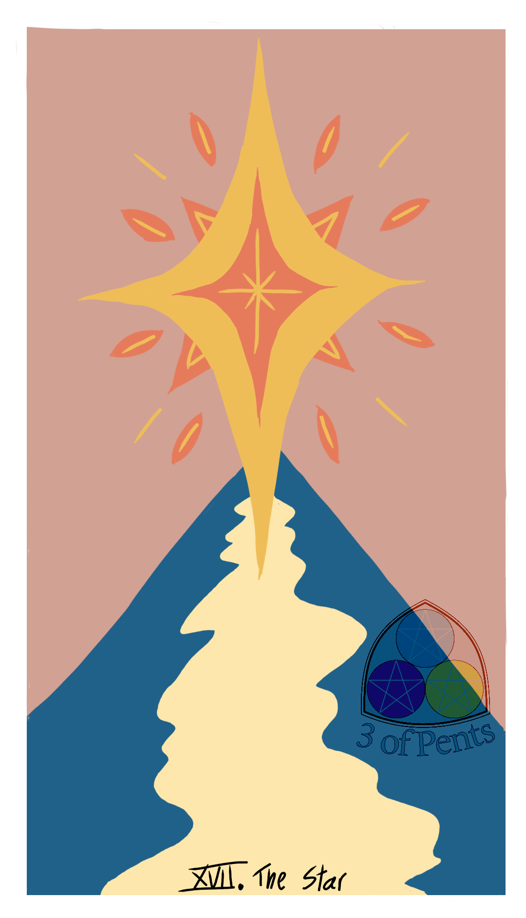
100 Palettes Challenge // Palette #1 // The Star
The very first entry into my 100 Palettes Challenge, using the palettes in "100 Years of Color" by Katie Greenwood.
This palette is from a poster, published in 1900, for an exhibition in Paris.
I chose to design a Star tarot card, mostly based entirely on the blue and yellow colors since the main symbolic images in The Star are the star (obviously) and water. In general I like how it came out! I think if I were designing it independent of this challenge I would've used a cooler color for the sky; I might have even used the blue for the sky and used a darker blue or purple for the water.
Looking at it now, I wonder how it would've looked different if I swapped the two pinks. But I also like how making the sky that pale pink and using the darker pink in the star gives it more dominance in the image.
I also considered adding some more lines for ripples in the water (the cream on the blue, and the blue on the cream). But I wasn't confident in my ability to make it look right, and I'm liking this color-block-y style lately.
100 Palettes Challenge // Palette #1 // The Star
The very first entry into my 100 Palettes Challenge, using the palettes in "100 Years of Color" by Katie Greenwood.
This palette is from a poster, published in 1900, for an exhibition in Paris.
I chose to design a Star tarot card, mostly based entirely on the blue and yellow colors since the main symbolic images in The Star are the star (obviously) and water. In general I like how it came out! I think if I were designing it independent of this challenge I would've used a cooler color for the sky; I might have even used the blue for the sky and used a darker blue or purple for the water.
Looking at it now, I wonder how it would've looked different if I swapped the two pinks. But I also like how making the sky that pale pink and using the darker pink in the star gives it more dominance in the image.
I also considered adding some more lines for ripples in the water (the cream on the blue, and the blue on the cream). But I wasn't confident in my ability to make it look right, and I'm liking this color-block-y style lately.
0 Comments
0 Shares
2 Views


