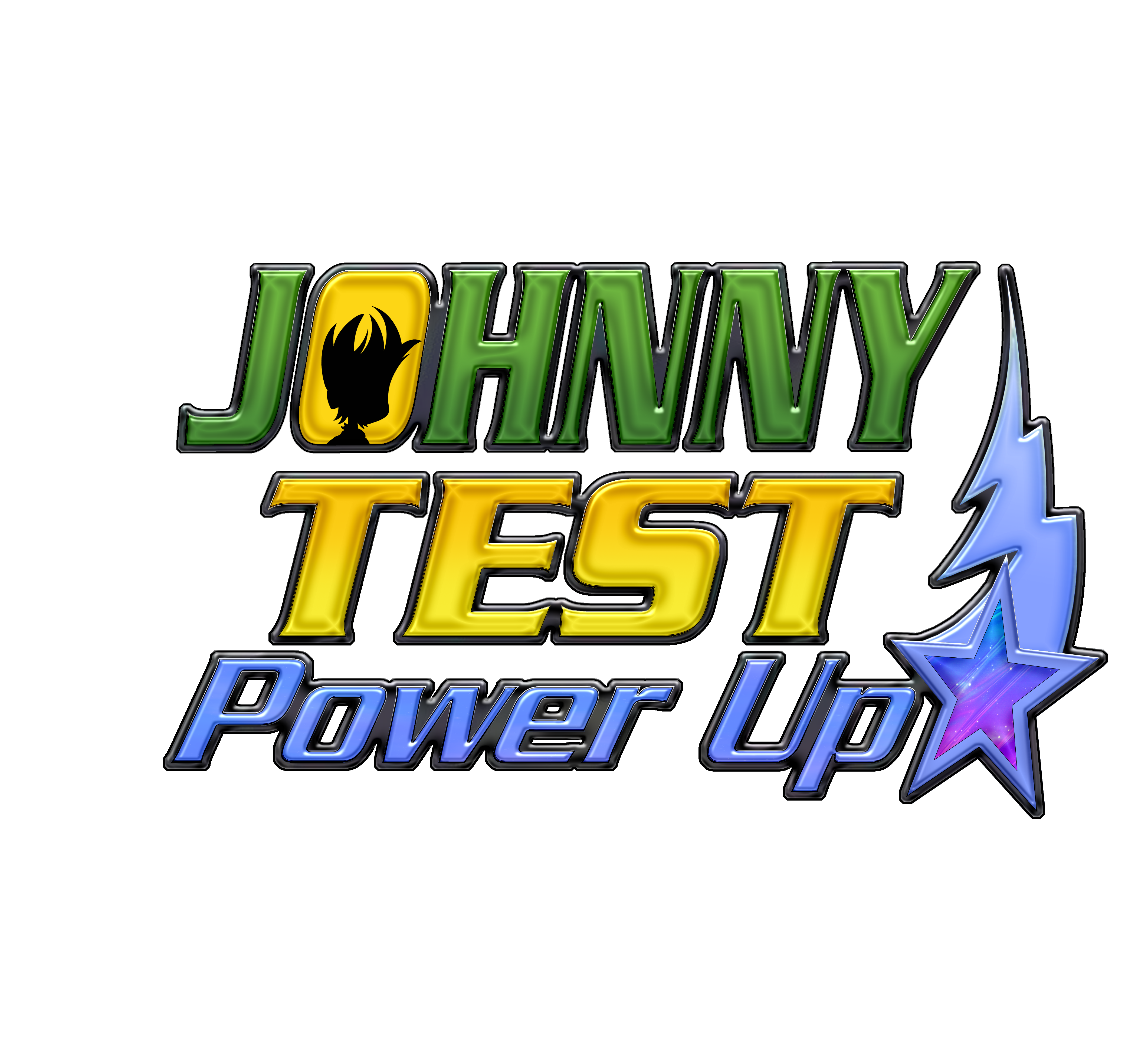
Here is the logo for "Johnny Test: Power Up!"
I experimented with many effects and fonts to get to the spacey and futuristic look, the series is going for.
Fun fact: This one was the second attempt of creating a logo. There was a first version, but I didn't like it, so I had to redo it from scratch, while adding a few new elements.
I experimented with many effects and fonts to get to the spacey and futuristic look, the series is going for.
Fun fact: This one was the second attempt of creating a logo. There was a first version, but I didn't like it, so I had to redo it from scratch, while adding a few new elements.
Here is the logo for "Johnny Test: Power Up!"
I experimented with many effects and fonts to get to the spacey and futuristic look, the series is going for.
Fun fact: This one was the second attempt of creating a logo. There was a first version, but I didn't like it, so I had to redo it from scratch, while adding a few new elements.
0 Comments
0 Shares
236 Views


